

Are you wondering which type of website design is best for your business? Responsive and adaptive designs are the two most popular options, but each has its own strengths and weaknesses. In this blog post, we’ll explore what makes these two approaches different and help you determine which one will work best for your needs. As experts in web design and development, Web Design Knutsford is here to guide you through the decision-making process.
What is Responsive Website Design?
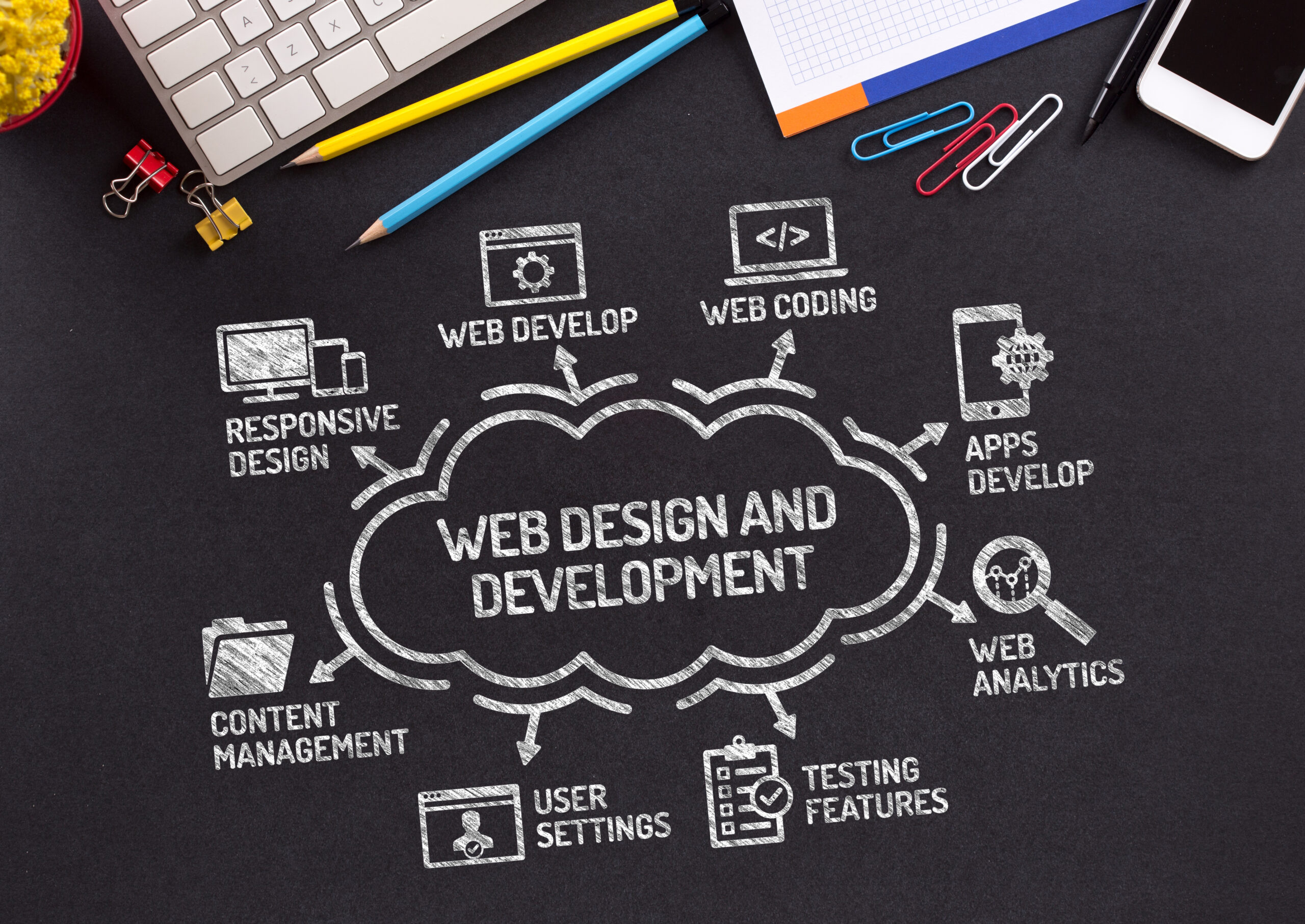
Responsive website design is an approach to web development that aims at building websites that adapt to different screen sizes and devices. It involves the use of breakpoints, which are specific points in the layout where changes occur to ensure appropriate display on different screens. The result is a flexible website that provides an optimal user experience across various platforms.
Adaptive website design, on the other hand, takes a more targeted approach by giving developers control over how their site appears on specific devices. This approach allows for more fine-tuned adjustments but requires more time and resources to build multiple versions of a site. Aaron Gustafson coined the phrase “adaptive web design” as he believed it was better suited for complex sites with unique functionality requirements.
In summary, responsive website design offers flexibility while adaptive design provides greater control over how content appears on certain devices. Ultimately, choosing between them depends on your business needs and goals.
Pros of Responsive Website Design
At Web Design Knutsford, we highly recommend responsive website design for businesses. One of the major pros is that it guarantees a better user experience on all devices. With responsive design, your website will adjust to fit appropriately on any device, from desktops to smartphones. This ensures that visitors are not only able to access your content easily but also have a seamless browsing experience.
Another advantage of responsive design is that it’s easier and quicker to build than adaptive design. Instead of setting specific breakpoints for each device type as in adaptive design, you create a single version of the site that adapts seamlessly to different screen sizes without losing control over the layout or content display. As Aaron Gustafson said: “Responsive web design represents a fundamental shift in how we’ll build websites for decades”. Lastly, with responsive web designs comes consistent content delivery across all devices which makes managing a business’s online presence much more straightforward and reduces complexity in maintaining their CMS system updates and marketing efforts at the same time ensuring brand consistency across all channels they operate on.”
Cons of Responsive Website Design
Slow loading times on mobile devices with slow internet connections can be a major downside of responsive website design. This can result in frustrated users and potentially lost business for your company. Additionally, images may not load properly on smaller screens, affecting the overall look and feel of the website.
Another drawback to consider is that responsive design offers less customization options compared to adaptive design. While breakpoints can help ensure appropriate display across various screen sizes, you have less control over how your website looks and functions overall. As Aaron Gustafson notes, “adapting our content strategy based on capabilities rather than viewport size means we start addressing more diverse audiences.”
What is Adaptive Website Design?
Adaptive website design is a web development approach that aims to deliver an optimized user experience by adjusting the layout, content and functionality of a website based on the specific device being used. This method involves creating multiple variations of a website for different screen sizes, rather than relying on a single responsive design. Adaptive websites can offer more tailored experiences to users, but require additional development time and maintenance.
The key advantage of adaptive website design is its ability to provide highly customized experiences for users across various devices. However, this approach can be more costly and time-consuming compared to creating a single responsive site. Additionally, since each version of an adaptive site requires ongoing updates and maintenance, it may not be the best fit for businesses with limited resources or tight budgets.
Pros of Adaptive Website Design
Adaptive website design offers several benefits that make it a suitable choice for modern businesses. Here are some of the key advantages:
- Enhanced User Experience: Adaptive websites provide optimal user experience, regardless of the device being used to access them. This ensures that users can navigate and interact with your site easily, improving their overall satisfaction.
- Improved Performance and Speed: Adaptive designs streamline content delivery by eliminating unnecessary elements based on device capabilities. By prioritising performance optimisation, adaptive sites load faster and respond better to user input.
- Tailored to Specific Devices: With an adaptive approach, websites are designed with specific devices in mind; this results in a more targeted interface for each type of device.
Overall, these benefits ensure that your business stays competitive by providing high-quality web experiences across all devices.
Cons of Adaptive Website Design
Higher development costs can be a major drawback of adaptive website design. Since the approach requires creating multiple layouts for different screen sizes and devices, developers need to invest more time and effort into coding. This complexity increases the cost of developing an adaptive website compared to a responsive one.
Maintenance can also be challenging for an adaptive site as it requires updating separate codebases for each layout. If changes are made in one version, they must be replicated across all other versions, leading to higher maintenance costs and potential errors or inconsistencies between them.
Finally, building an adaptive website takes more planning than a responsive site because designers must determine which breakpoints should trigger layout changes. This may require extensive user research and testing to ensure that the experience is consistent across various devices without compromising on functionality or aesthetics.
Which One is Right for Your Business?
When deciding between responsive and adaptive website design, there are a few factors to consider. Responsive design is best for businesses that need a simple, straightforward approach to their website. Adaptive design is better suited for companies with more complex websites or those who want greater control over how their site is displayed on different devices.
Case studies have shown that both approaches can be effective in improving user experience and increasing conversions. However, it ultimately comes down to the unique needs of your business and what will work best for your audience. At Web Design Knutsford, we can help you determine which approach is right for your specific situation and create a website that meets all of your requirements.
Factors to Consider
When deciding between responsive and adaptive website design, it is important to consider your target audience and their device usage. Understanding which devices your audience uses the most will help you determine the best approach for delivering a user-friendly experience on all screens.
Another factor to consider is budget for design and development. Adaptive websites often require more resources than responsive ones due to the need to create multiple versions of each page. It’s important to weigh the benefits against the costs before making a decision.
Finally, having a strong content strategy in place can greatly impact the success of either type of website design. Clear messaging and organization will ensure that users can easily navigate your site no matter what method you choose.