

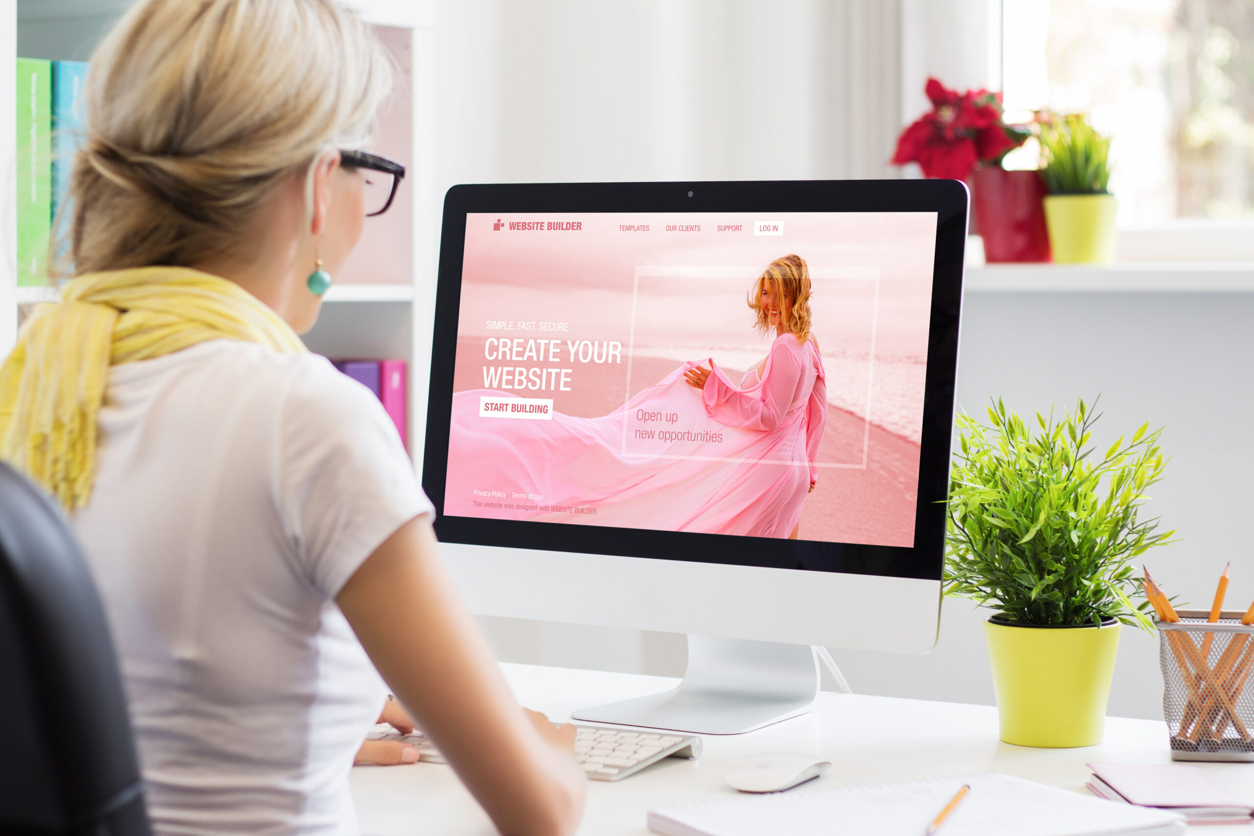
At Web Design Knutsford, we understand the importance of typography in website design. Your choice of font can make or break your website’s overall look and feel. In this blog post, we’ll explore why typography matters, the factors to consider when choosing fonts, and best practices for typography web design. Join us as we dive into the power of typography!
Importance of Typography in Website Design
Good typography makes your website comfortable to read, improves its accessibility, and enhances user experience. The use of beautiful typefaces with bold colours can establish brand identity while improving readability for users who might not have perfect eyesight. To illustrate this point further; take popular websites like Medium or Bloomberg as examples where excellent typography is evident in their designs. Overall, neglecting typography may seem insignificant but could undermine the entire essence of a well-designed website that meets all criteria for success online such as increased visibility and higher conversion rates among others.
Establishing Brand Identity
Choosing the right typeface is one of the basics when establishing your brand identity. Your chosen typeface should reflect your brand’s personality and values, be legible, and visually appealing. A beautiful yet comfortable font can help to create a positive first impression while enhancing user experience on your website.
Creating a consistent visual hierarchy across your website design is crucial in highlighting key messages with typography. Using bold or contrasting colours for headlines and subheadings can draw attention to important information, guiding users through your content effortlessly. Incorporating these elements into more than just text but also icons or graphics can create an overall cohesive look that supports a strong brand identity.
Enhancing User Experience
Improving navigation is one of the basics in enhancing user experience. Clear labels and fonts help users to understand where they are on the website. Using readable typefaces for different screen sizes ensures that all visitors can comfortably engage with your content. By designing for accessibility through font choice and contrast, you can ensure that people with visual impairments have a comfortable browsing experience.
In addition to improving functionality, typography can make a design beautiful too! Bold elements such as colour choices and unique fonts add personality, making your website memorable. These design elements should be used sparingly but effectively – take Apple’s use of San Francisco font as an example; it’s clear yet distinctive enough to reflect their identity without detracting from usability.
At Web Design Knutsford, we believe that good typography is essential in creating successful websites. Contact us if you want professional advice on how to use typography to enhance your site’s user experience!
Improving Readability and Accessibility
At Web Design Knutsford, we understand the importance of improving readability and accessibility in website design. One way to achieve this is by increasing line spacing to improve legibility. This basic element can make a big difference for readers, especially those with visual impairments or dyslexia. By choosing a comfortable line spacing, users are able to read text more easily and enjoyably.
Another way to improve accessibility is by choosing colour contrasts that meet WCAG standards. This involves using bold colours that have enough contrast between foreground and background elements, making it easier for all users to read content on your website. At Web Design Knutsford, our designers use beautiful colour schemes while also considering accessibility guidelines for the benefit of all users.
Incorporating alternative texts for images using typography is yet another way of enhancing website accessibility with typography design elements. Alternative texts help visually impaired users comprehend images through screen reading software; therefore they need descriptive information about what an image conveys beyond its visual appearance alone. Why not let our team at Web Design Knutsford create unique designs which incorporate these accessible features?
Factors to Consider in Typography Website Design
At Web Design Knutsford, we understand that selecting the right typeface is crucial for effective communication on a website. It’s essential to consider factors such as readability, brand identity and tone of voice when choosing a font. With numerous typefaces available, finding one that aligns with your brand values can help create an emotional connection between users and your site.
Font size plays a significant role in user experience. A font that’s too small can be challenging to read, while one that’s too large may come across as overpowering. Establishing a hierarchy by using varying sizes and weights enhances readability and guides users towards essential information. At Web Design Knutsford, we recommend balancing legibility with aesthetics for optimal design results in typography website design.
Typeface Selection
When it comes to selecting a typeface for your website, matching it with your brand identity is crucial. The right font can convey the tone and personality of your brand, while also making it more memorable. However, legibility and readability should not be overlooked in favour of design aesthetics. A typeface that is difficult to read may turn off visitors from exploring further into your website’s content.
While sticking with popular font families like Helvetica or Arial can save time and provide familiarity, exploring less common options can give a unique look to your website. Don’t be afraid to experiment with different fonts until you find one that truly complements your brand identity while still being easy on the eyes for visitors. A well-selected typeface can make all the difference in creating an effective website design that engages users and leaves a lasting impression.
Font Size and Hierarchy
Creating a visual hierarchy with font size variations is an important aspect of website design. Font size can make a huge difference in the way content is perceived and understood by visitors. It helps to guide their eyes through the page, highlighting key information and creating a sense of importance.
Making sure text is readable across all devices is crucial when it comes to selecting appropriate font sizes for headings, body text, and captions. A great typographic system should be legible on every device- mobiles, tablets or desktops- without compromising its impact.
Appropriate font sizes for headings, body text, and captions are essential in establishing proper hierarchy that will influence how users interact with your site’s content;
- Headings should always have larger fonts than body texts.
- Body texts should be large enough to read comfortably without straining the user’s eyes.
- Captions should be small but still easily legible.
When done right typography can significantly improve user experience while keeping them engaged longer on your website.
Spacing and Layout
Adjusting line spacing for improved readability is crucial in website design. Proper spacing between lines helps readers easily comprehend the content, making the reading experience more enjoyable. Additionally, balancing white space for an aesthetically pleasing design gives a clean and professional look to your website.
Choosing appropriate margins and padding to create a cohesive layout also plays a significant role in typography website design. A balanced layout allows visitors to navigate through your site with ease while creating visual interest on each page.
To achieve effective Spacing and Layout in typography website design, consider the following:
- Use consistent margins throughout the site
- Ensure that there is enough white space around text
- Avoid cramming too much information together on one page
- Use appropriate padding between elements such as images or videos
In conclusion, proper Spacing and Layout are essential components of great typography website design. They help improve readability while providing an aesthetically pleasing experience for visitors navigating through your site. At Web Design Knutsford, we understand how important it is to get these details right when designing websites that effectively engage audiences online!
Best Practices in Typography Website Design
Consistency and contrast are key elements to consider when it comes to typography website design. Consistent use of font styles, sizes, and colors across the website creates a cohesive look that enhances user experience. Contrast helps important information stand out from the rest of the text, effectively guiding users through your content.
Limiting your selection of typefaces is also crucial for effective typography in website design. Too many different typefaces can create confusion and clutter on the page. Instead, choose two or three complementary fonts that will work well together and stick to them throughout your site’s pages.
Finally, establishing hierarchy through careful placement of headings and subheadings reinforces content organization while improving readability for users at a glance. By following these best practices in typography website design, Web Design Knutsford can help businesses optimize their online presence for success in today’s digital marketplace.
Consistency
Maintaining a consistent font size throughout the website is crucial for ensuring that your text is legible and easy to read. The use of different font sizes can create confusion and disrupt the flow of information, so it’s important to stick to one standard size.
Using the same font family for both headings and body text can help create a cohesive look on your website. Choosing complementary fonts within the same family can also help differentiate between different levels of hierarchy, while still maintaining consistency.
Ensuring line spacing is consistent across all pages helps maintain readability and legibility throughout your site. Avoiding large gaps or cramped lines will make reading easier for users, resulting in a better overall experience on your website.
Contrast
Choosing contrasting colours for text and background is one of the fundamental principles of typography. It aids in improving the readability and visual appeal of a website. Pairing light-coloured fonts with dark backgrounds or vice versa helps to make your content stand out, so it’s easier to read.
Using bold or italicized fonts sparingly is also crucial when emphasizing critical information on your website. When used strategically, they can draw attention to important points without overwhelming users with too much weight or style variation. Proper use of these techniques improves scannability and makes it simpler for users to find what they’re looking for.
In addition, adjusting letter-spacing and tracking is another simple but effective way to enhance legibility on websites. By increasing space between letters in blocks of texts—especially smaller font sizes—you can improve reading speed without sacrificing comprehension levels while maintaining optimal proportions.
Limited Typeface Selection
When it comes to typography in website design, less can often be more. Selecting a limited number of typefaces can result in a cleaner and more cohesive overall appearance. Here are some tips for choosing the right typefaces for your website:
- Choose no more than three fonts
- Use web-safe fonts to ensure consistent display across devices
- Avoid overly decorative or ornate fonts that may be difficult to read online
By limiting your font selection and choosing appropriate options, you can create a visually appealing design that is easy to navigate and read. Remember that typography plays an essential role in establishing hierarchy and guiding user attention on your site.
Hierarchy
Establishing a clear visual hierarchy is crucial in website design. By using larger and bolder headings for primary content, and smaller subheadings for secondary content, users are able to easily navigate the site without feeling overwhelmed by information. It’s also important to differentiate between body text and captions using different type sizes or styles. This not only adds contrast but also helps readers distinguish between different types of content.
Using varying weights of the same font family is another effective way to create contrast while maintaining consistency throughout the site. It’s important to limit your selection of typefaces so that your typography remains consistent across all pages, creating an overall cohesive look for your website design. Taking these steps towards establishing hierarchy will greatly improve user experience on your website and make it more visually appealing to visitors.
Conclusion
Typography is a powerful tool that can enhance the overall design and user experience of a website. By implementing appropriate typography choices, designers can communicate messages effectively and create visual interest. Through this blog post, we have explored various aspects of typography in website design such as font selection, size, spacing, hierarchy and more.
In conclusion, it is important to prioritize typography in website design to improve user engagement and retention. Keeping consistency throughout the entire site with effective use of typefaces will make your text legible and easy to read for users on any device or screen size. A well-crafted typographic system will help you convey your message at first glance while creating an emotional connection with your audience through the power of words.